2.1 Basic graphics concepts
In computer games, and most visual or other sensory media until you meet things like abstract works (note a somewhat different concept to abstraction as seen elsewhere in this document), there are two concepts that feed off each other at work. 1) is the suspension of disbelief and 2) is getting the audience to use their imagination. 2) is the subject of any good artistic tutorial but in the meantime think how a camera might pan away and use some audio cues rather than attempting to display violence or a good book will spend a lot of time setting a scene and describing things or otherwise describe situations compelling to humans. As it is very involved 2) is not really something that can be covered here other than to say it is well worth learning about, even if you are mainly a technical person, both in general and to help when you try to guess what methods will be used to achieve an effect. 1) however is much more of a scientific discipline, although to cover it in depth we would have to delve into various aspects of biology and psychology, so it gets covered. To make an image look real, assuming you want that sort of thing3 , it
- Has to replicate enough colours that the human eye can not tell (this is typically taken to be about 24 bit aka 16.7 million colours, although those that edit images like to go to 32 bit (4294967296 values) so as to have more information to edit with and avoid having colours jump from to the other) and although the GBA and DS screen is 16 bit it can do the job if you do it right.
- Has to have enough information, this typically means having a point and the point next to it not being distinguishable from one another (if you can see the points that make up the average image something has gone wrong). Now there are ways around this as the human eye is better at brightness (luminance) than colours and there is such a thing as empty magnification where you can blow things up/zoom in but no real new information will be gained, not to mention humans do not see ultraviolet so it tends not to be replicated in imagery. Indeed much of lossy compression is tasked with doing just this.
The alternative to actual pixels and having 3d ultimately rendering into pixels is so called vector imagery. Vector imagery is named for the mathematical/graphing term called vectors and defines images entirely mathematically (for instance “draw a square, line thickness 3 with a length of 4 at point 0,14” can be scaled to any size with simple multiplication). Fonts on computers have used it for years and consoles have recently got into it (newer fighting versions of Street Fighter being noted for it) but it is quite rare to see in the end result of a console game, much less a handheld title. Still if you want to there are programs like Inkscape that you can try out and attempting to render pixel art as vector imagery is quite a popular activity in certain circles.
2.1.1 Aliasing
Most screens in the world (and as far as games go it is mainly only the Vectrex that differed here) use a grid of pixels that can be individually set to various colours to display images. Rendering this out means a nice defined line can appear as a run of a couple of pixels and then appear to shift one pixel and then another run. The human eye is quite adept at picking this up, and, unlike certain other concepts in video and graphics, even when otherwise not trained to (see the example below) so techniques (known as anti aliasing) were developed to lessen the effect.
Example (might need to zoom in a bit)
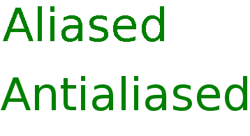
PIC
This is also a problem when you take an image that was made at one size and scale it up, or sometimes when you scale it down, to something that is not a simple half (or quarter or so on) size of the original, beyond that though scaling non vector imagery has several potential pitfalls so do it sparingly or even better do not do it at all.
2.1.2 Haloing
Related in some ways to aliasing above, aliasing and the techniques to dodge it can trouble things. Here when trying to select just the outline of an item on a complex background it might be hampered by the anti aliasing which has a habit of causing a slight merging/smoothing of colours and transitions, as a result a coloured outline can appear around it which looks not unlike a halo. This is one of the reasons why sprite sheets and similar things will often come as a selection of sprites on a hot pink or lime green background which lessen merging effects.
2.1.3 Bit depth
In general imagery it means one thing and that is how many bits are assigned to colours, something which was covered in the introduction to this section, but in 2d console imagery it means what number is assigned to represent each pixel with typical values being 4 and 8, though 1 and 2 are seen commonly enough on various systems, including the GBA and DS. Now this does not mean 4 and 8 bit colours but that you can select from a choice of colours from a premade selection which is composed of 16 bit colours. Later on a concept known as “sector addressing” is covered which works on a related principle.
It stems from robotics but there is a concept known as the uncanny valley which reads in brief “As a robot gains more human like qualities then humans will react more favourably to it on an emotional level, this is until a tipping point is reached where the robot is fairly similar to a human but not quite and humans will start reacting less favourably, or even negatively, on an emotional level until the robot gets considerably more realistic (no small feat). At such a point the emotional reaction turns back towards the positive”. The idea has parallels throughout media and other attempts to emulate either a human or something that is seen in the real world. To this end going for ultra realism is not always the best bet.↩︎